SaifBrand

Multi-Sector Mobile Prototype — One Design System, Three Verticals

A design contest asked for an interactive mobile prototype covering three sectors at once: technology, finance and education. Instead of three separate mockups, I built one design system with three themes, running as real code in the browser.

🏁 Contest entry — this one went to another entrant. The client's product concept stays confidential, so this page shows only the design-system work; the demo link is retired and the screens below are the real build.

📋 The Brief

Three Sectors, One Consistent Product

The brief asked for reference research per sector, an information architecture, five key screens (home, search, detail, profile, settings) adapted to each of the three verticals, a linked navigable prototype and a mini style guide. The hard part is the contradiction inside it: every vertical needs its own identity, but the product still has to feel like one app. My answer was to keep the skeleton fixed and let only the data, the colour and the vocabulary change.

📱 See It In Action

Real Screens, Not Mockups

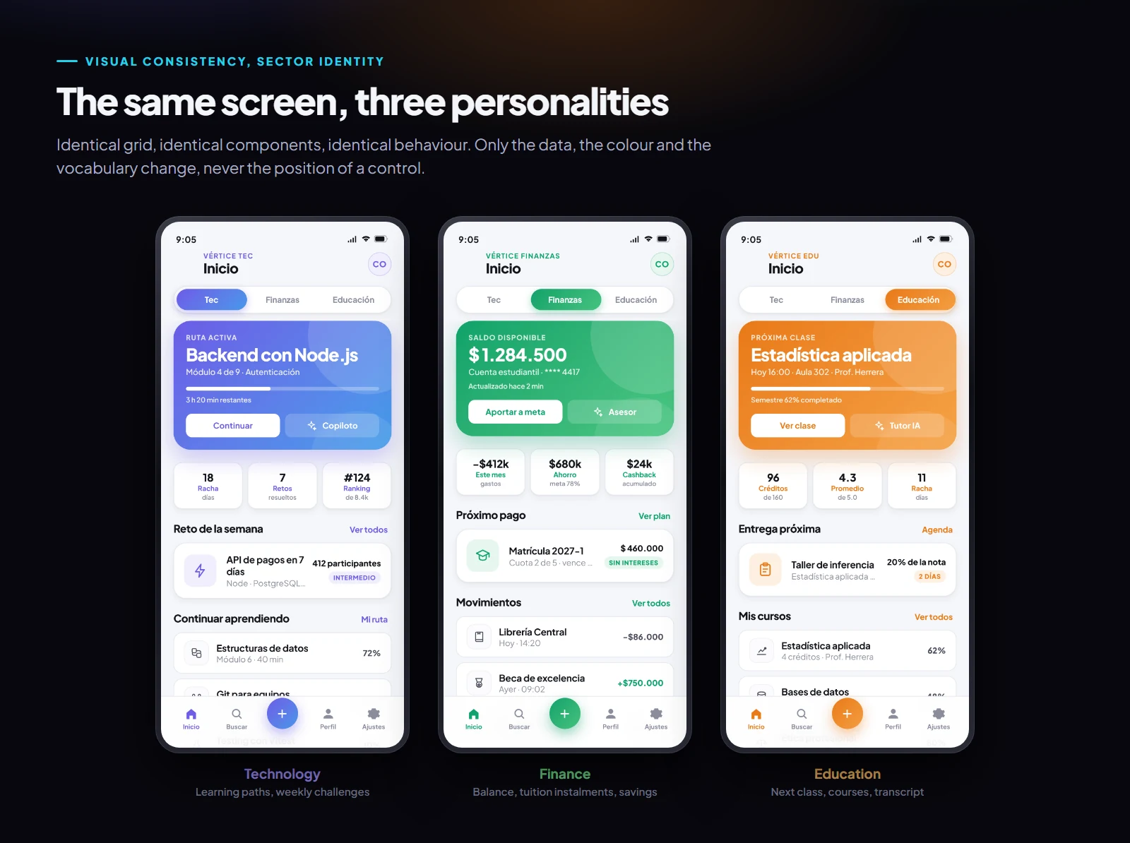
The same home screen rendered in the technology, finance and education verticals, sharing one grid and one component set
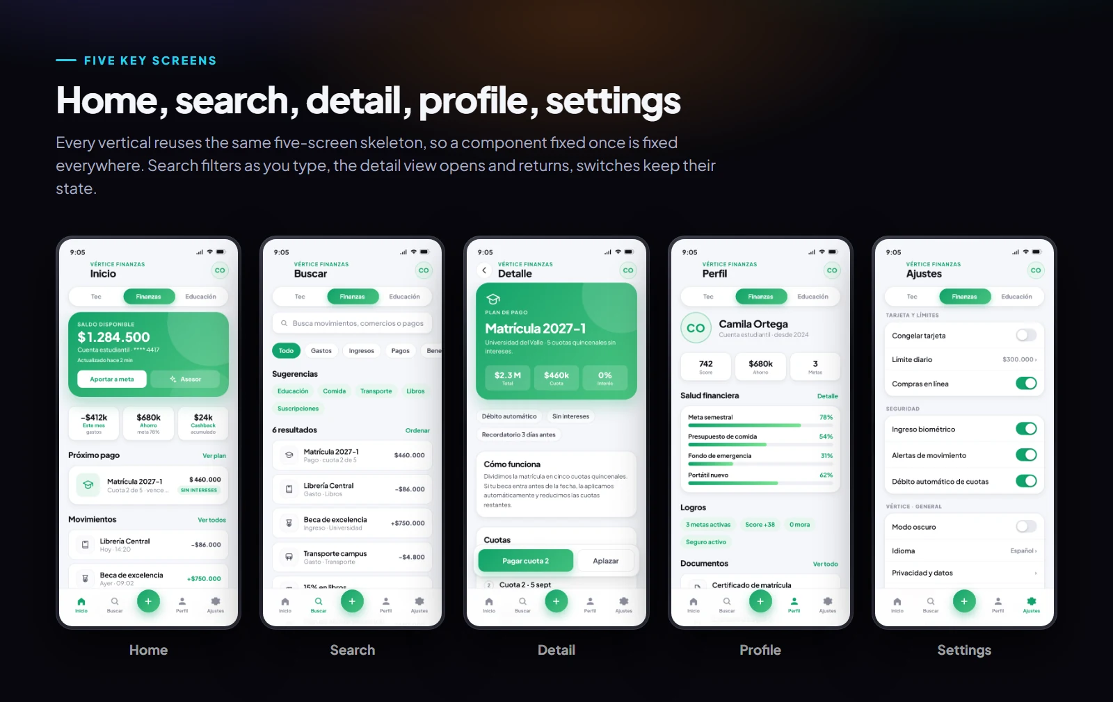
The five key screens of the prototype: home, search, detail, profile and settings
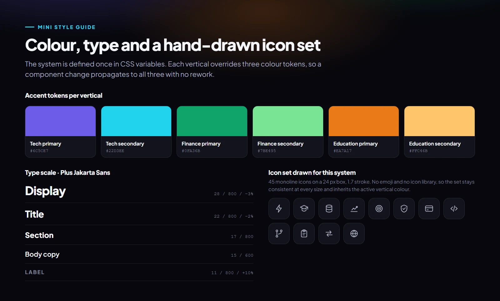
Mini style guide: accent colour tokens per vertical, the type scale and the custom monoline icon set
What Was Built

A Prototype That Actually Responds

🎚️

One Switch Re-Themes the Whole App

A segmented control at the top swaps the vertical. Colour, tint, gradients, iconography and content all change together, while not a single control moves position. That contrast is the entire argument of the piece.

Real Interaction, Not Flat Images

Search filters as you type, detail views push and pop, quick-action sheets slide up, toggles hold their state per vertical, a contextual assistant answers, and there is a complete dark mode with its own tint per sector.

🧩

Content Separated From Design

Each vertical is a plain data object; the theme is three CSS custom properties. Adding a fourth sector means adding one object and three colours, not redesigning the app. The scalability claim is true in the code, not just on a slide.

✏️

45 Icons Drawn For This System

No emoji and no icon library. A monoline set on a 24 px box with a 1.7 stroke, so icons stay consistent at every size and inherit whichever vertical is active.

Built as plain HTML, CSS and JavaScript with no framework and no UI library, so it loads instantly and any change can ship the same day. Delivered in Spanish for a Latin American client.

Like What You See?

Need One Product to Work Across Several Sectors?

If you are juggling multiple audiences and do not want three disconnected apps, a shared design system with per-sector themes is usually the answer. Let's talk about yours.