SaifBrand

Clinic SaaS Brand Identity — A Logo That Works Without Its Name

A design contest for a cloud clinic-management platform: patients, appointments, treatments, billing, inventory and AI workflows in one product. The brief wanted a symbol that could stand alone as an app icon, the way the big software brands do, and ruled out every medical cliché.

🏁 Contest entry — the holder picked another designer. Everything below is the full identity I delivered for judging, drawn in vector from scratch.

📋 The Brief

No Cross, No Heart, No Pulse Line

The holder was explicit: no medical crosses, hearts, ECG lines or stethoscopes. It had to feel premium and technical, sit naturally on their existing navy, blue and purple interface, and be recognisable as an icon on its own. They also listed seven things every entry had to show: the primary logo, the logo on white and on navy, the standalone icon, a favicon, a square app icon, and the logo inside a real dashboard sidebar.

🎨 The Presentation

Every Board, One System

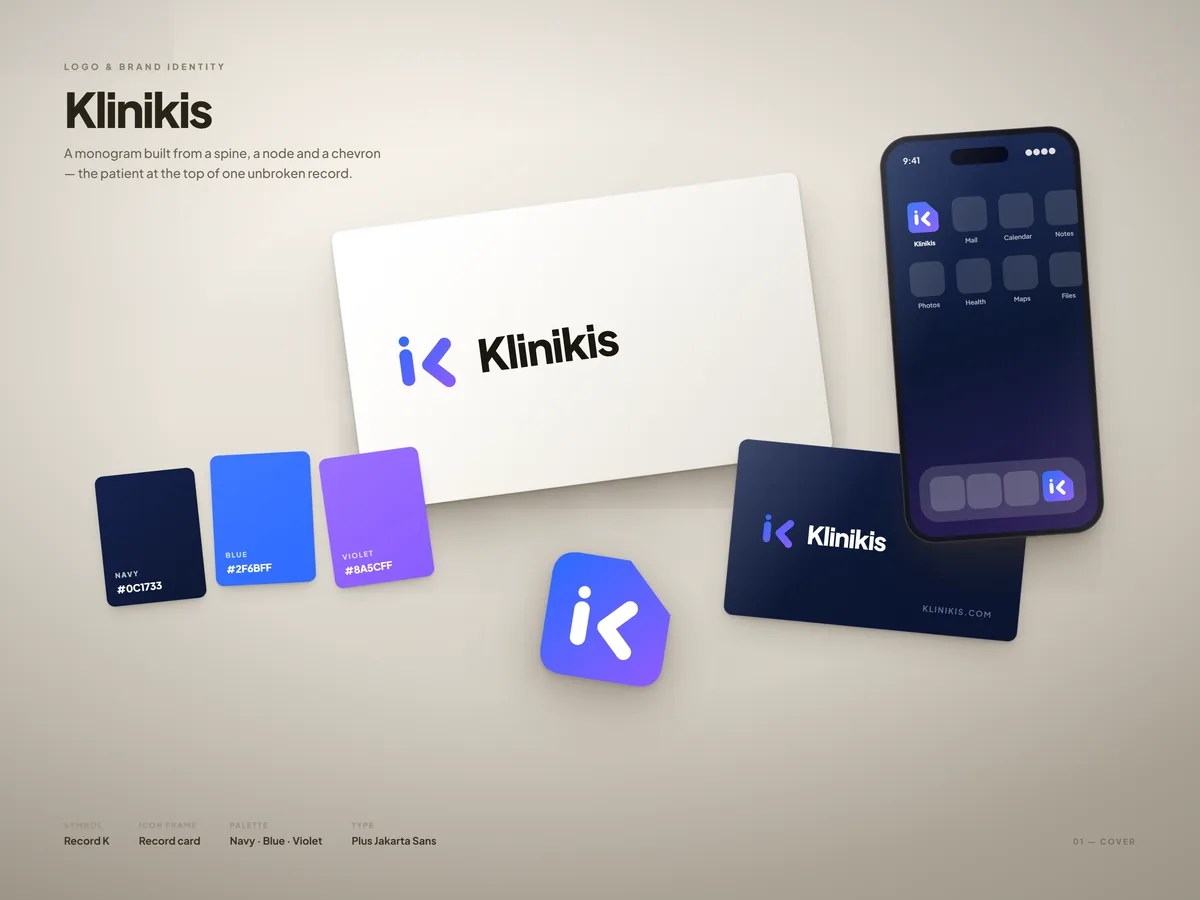
Cover board: the logo printed on paper cards, a navy business card, colour swatches and the app icon on a phone home screen
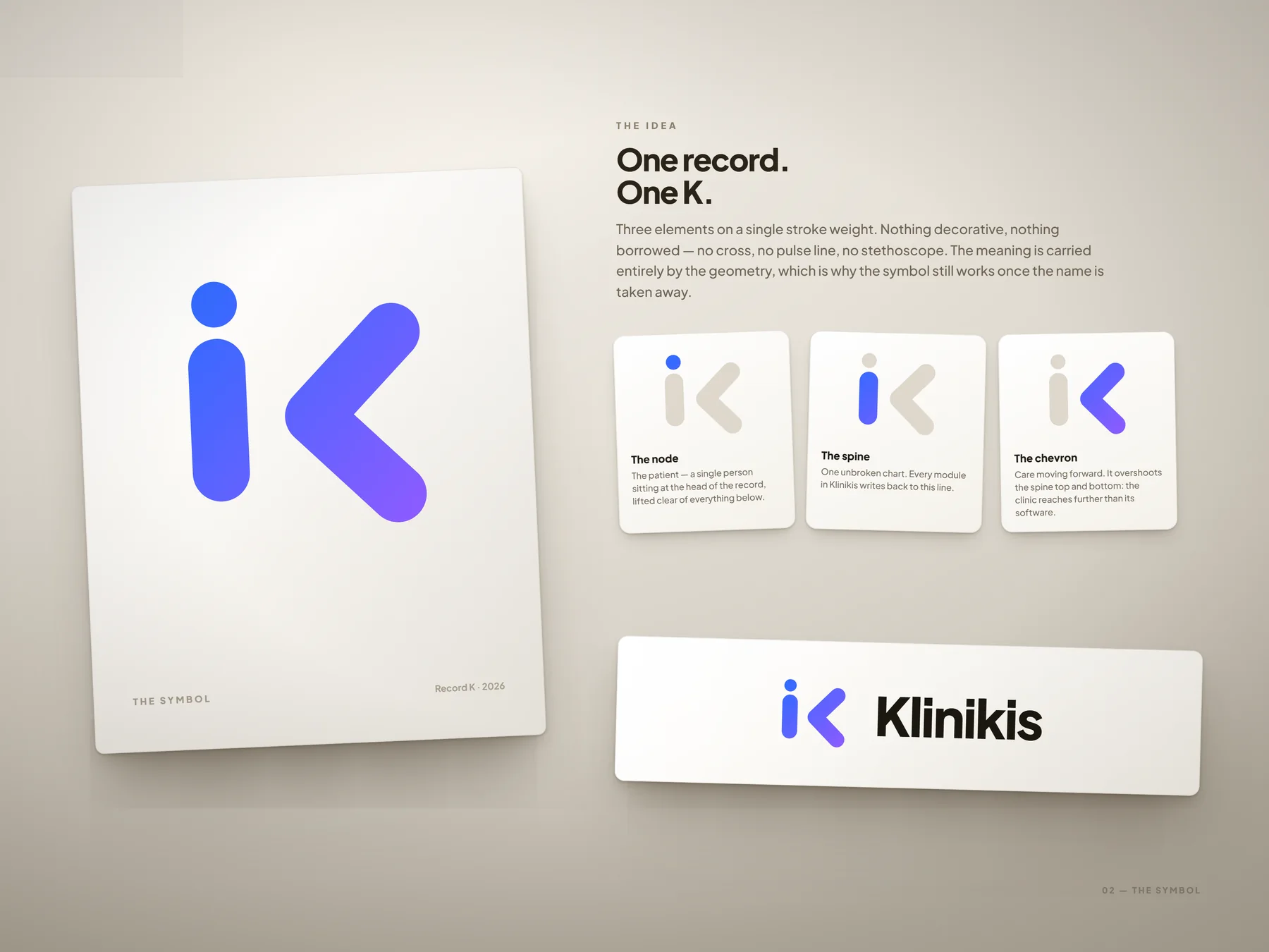
The symbol explained: an upright spine, a detached node and a chevron that overshoots the spine, each shown on its own card
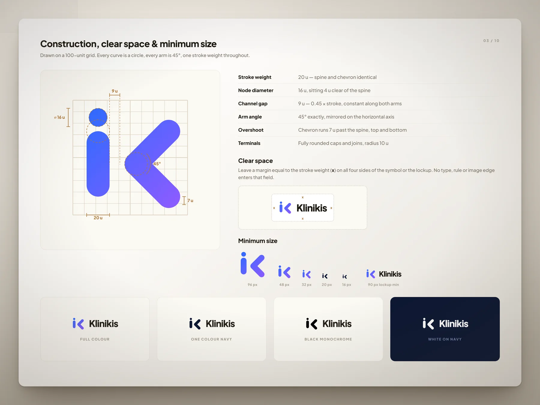
Construction sheet on a 100-unit grid with stroke, gap, node and angle measurements, clear space, minimum sizes and one-colour versions
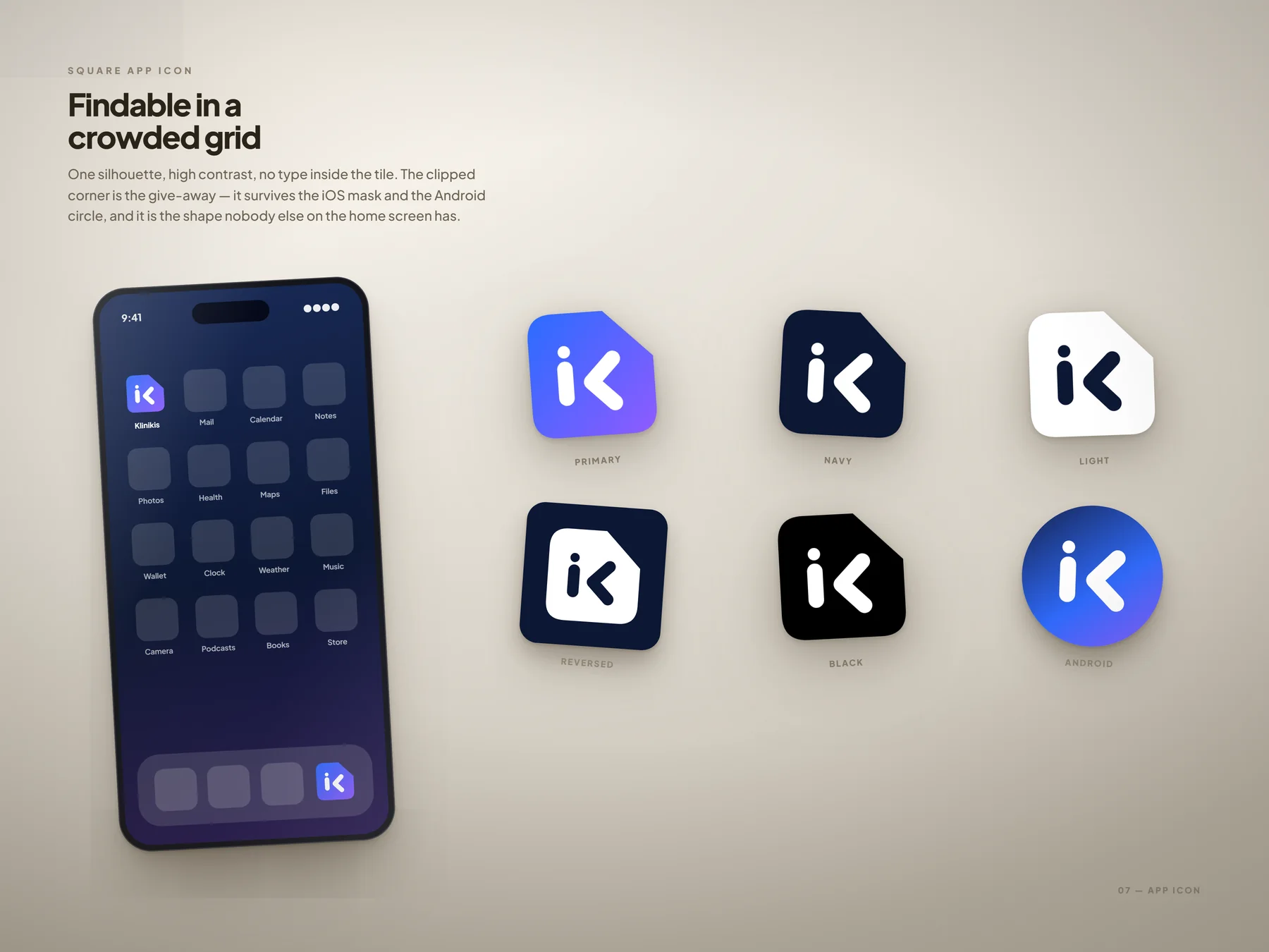
The clipped-corner app icon on a phone home screen and in primary, navy, light, reversed, black and Android versions
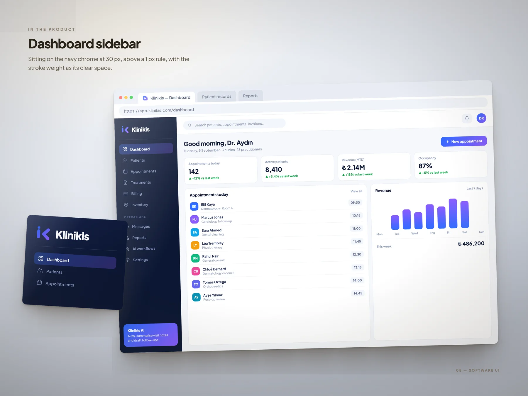
The logo in the product: a clinic-management dashboard in a browser window with the logo in the navy sidebar
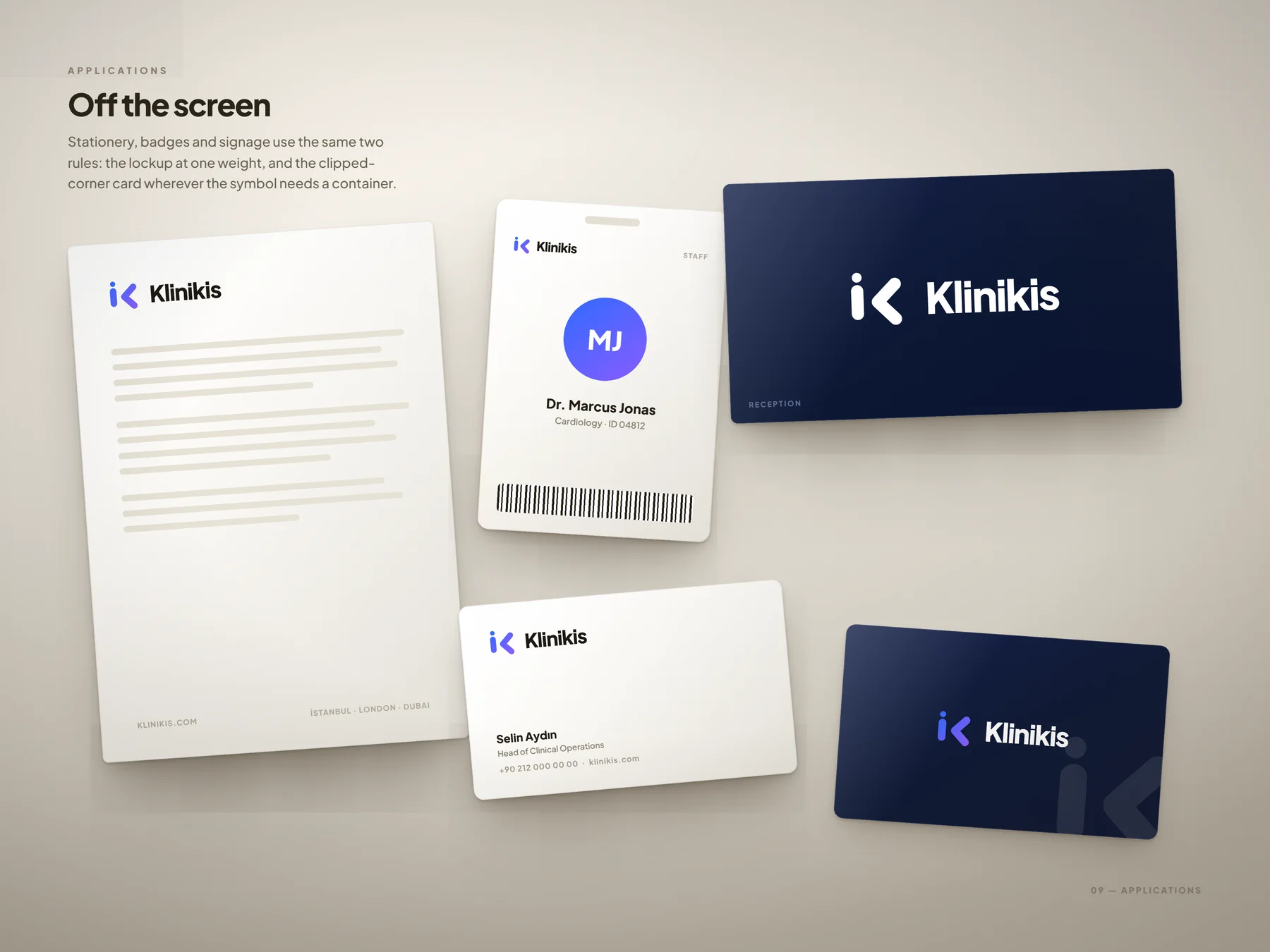
Applications: letterhead, staff ID badge, reception sign and business cards
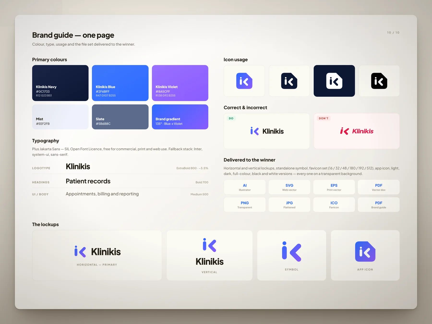
One-page brand guide with colours and HEX/RGB values, typography, icon usage, correct and incorrect use and the delivered file list
What Was Built

What I Actually Built

🧬

A Mark With a Reason in Every Part

An upright spine for the single patient record, a node lifted above it for the patient, and a chevron that overshoots the spine for care reaching further than the software. Read together it is a K; the spine and node also quietly form the i of the name.

📐

Drawn on a Grid, Not Traced

One 20-unit stroke weight, a 9-unit channel, a 16-unit node, 45° arms and fully rounded terminals. Six directions and eleven icon frames were explored before this one was chosen, each tested down to a 16 px browser tab.

📱

An App Icon That Means Something

The icon sits in a card with its corner clipped — a record card. It is the one frame shape nobody else on a home screen uses, and it survives the iOS mask and the Android circle.

📦

A Real File Set, Not Just Mockups

Horizontal and vertical lockups with the wordmark outlined, symbol and app icon in colour, navy, black and white as SVG and PDF, transparent PNGs, the full favicon set from 16 to 512 px with an ICO, and a one-page brand guide.

Type is Plus Jakarta Sans ExtraBold under the SIL Open Font Licence, so the client can use it anywhere without a licence fee. The presentation boards were composed as lit studio scenes rather than flat grids, so the identity reads as a finished object.

Building a Software Product?

Need a Logo That Also Works as an App Icon?

Most SaaS logos fall apart the moment the name is removed. If yours has to live in a browser tab, a home screen and a dashboard sidebar, let's design it for all three from the start.